All of us who work with data could donate some of our expertise to charitable causes through non-profit organizations. The organization DataKind helps to bring together volunteers with organizations who need data related services. I decided to attend an event organized by DataKind’s European operation DataKindUK based in London. The event, which was basically a hackathon, took place the last weekend of July and was named the “DataDive”.
The event was well attended, both by volunteers and by organizations who wanted our help. Four organizations were chosen to present their requirements, goals and expectations. They each brought their own data and made it available to the volunteers.
I decided to help the organization HelpAge International who was looking for meaningful data visualizations to be used in their brochures and marketing materials. Their aim is to bring attention to the issues that older people face when trying to make a decent living in all the countries in the world.
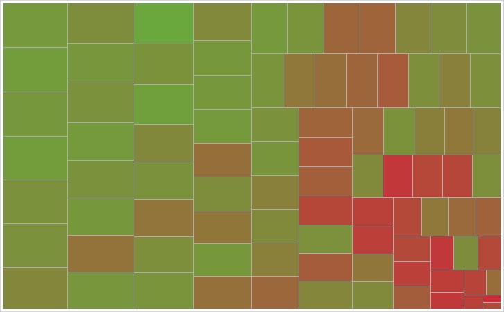
 The event in London had a very hacker feel. Each attendee brought his or her own laptop computer and their own software or tools. Our group quickly decided who will do what and how we will split the work. With my business intelligence background I decided to build heat maps and tree diagrams of various indicators that represented the numbers with visual impact. Other team members made other types of visualizations, for example time series, maps and similarity diagrams. I am not allowed to show the results yet because the organization will announce them through a press release when they have all the marketing materials completed.
I’m glad that I decided to donate my experience for a good cause. I met a bunch of new people and had a good time for a couple of days in London.